Burn Notice – Season Finale Storyboards

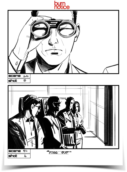
Here are some storyboards I was asked to do for season 5’s finale of Burn Notice. I was on a feature at Dreamworks at the time so I was able to offer a couple hours a night after work as well as weekends.

The workload was ridiculous and these were done directly with no preliminary sketches (clearly).

To see all of the boards click here:

Storyboarding – Traditional vs Digital Media

Storyboards used to be and in many cases still are done using traditional media- paper, pencils, ink pens and markers. These things are easy to carry around and are inexpensive to purchase. They are both basic and fundamental. These basic supplies should be in the kit of any storyboard artist.

They are essential for situations where an artist is needed in an emergency situation, on location. One example was on a film called Five Days of War, directed my Renny Harlin. I was on location with the crew in a small town called Tsalka, in the Republic of Georgia. There was a huge exodus scene involving hundreds of local extras, thousands of blanks, pyrotechnics, animals, two Georgian attack helicopters and a camera helicopter.  The pilots were Georgian military and didn’t speak English. Renny was running into language barriers and had to be sure the pilot understood how he wanted the scene shot.

I got the call where I was working in a trailer back at base camp. I ran about 4 village blocks, trudging through thick muddy roads to the shooting location and was told what I needed to sketch. I drew up a few shots in a Moleskine notebook which was quickly handed off to Renny. Drawing is a universal language, if you can draw, you can communicate with anyone who can see.  Below are a couple of the on-the-fly boards, done in a matter of minutes for the Georgian helicopter pilot.
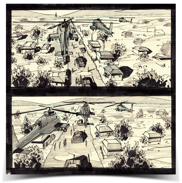
[Five Days of War storyboards by Jonathan Gesinski]

For the most part these days, I do work digitally though. There’s no shame to be had in it. Using technology to better your product, provide a better and more useful tool for your client and to work more efficiently is only wise.

Storyboarding or any form of commercial artwork is not fine art. It is impossible to cheat. You do whatever you need to to get your client, be it a director or whomever, something that will help them and ideally make them look as awesome and creative as you can. Using computers to create and manipulate images is an extremely efficient and effective tool. With computers, working digitally, an artist can reuse images already created, easily combine elements into new images, repair and adjust sketches, all in ways not possible when working on actual paper. Again, the aim is to get your client what he needs as fast and accurate as possible. Your job is to convey his idea, to duplicate it so that others can sync up with and work toward making his vision a reality.
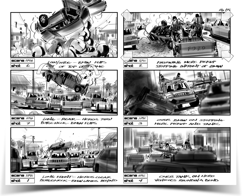
[Five Days of War storyboards by Jonathan Gesinski]

Adobe Photoshop is a great program. I probably don’t even need to mention it. The program I use for all of my commercial, digital artwork is Corel Painter 11. It does have problems, glitches and needs to have plenty of kinks worked out but what makes it worth it is Painter’s brush engine. The brushes in Painter are awesome and often times, work created in Painter can be difficult to tell apart from work created in traditional media. Many clients still don’t like a very “digital” look. This is another situation where Painter comes in handy. You can work digitally and a client who doesn’t like a digital look will be happy with what you turn in.
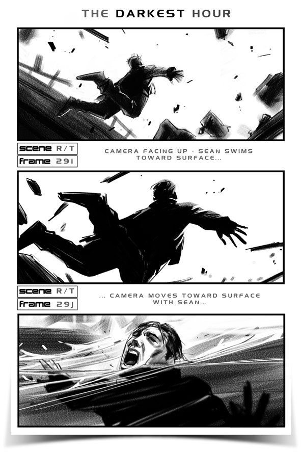
[The Darkest Hour storyboards by Jonathan Gesinski]

Using draw on-screen tablets such as the Wacom Cintiq or tablet computers such as the Axiotron Modbook is also a very natural feeling way to go. Back in the Republic of Georgia, pretty much all of my work was done on a Modbook.

You can see more storyboards and illustration here.

Ideally, being proficient with traditional media is the way to go. Having that tool in your belt, explore going about the same thing using digital tools. See what works best. But ultimately, regardless of how you get there- tell your stories as best you can pull the viewer in and don’t let him go. Draw and draw a lot. Have fun!

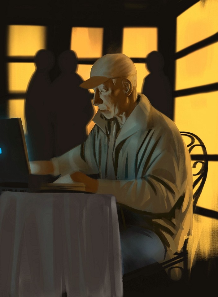
iPad sketches

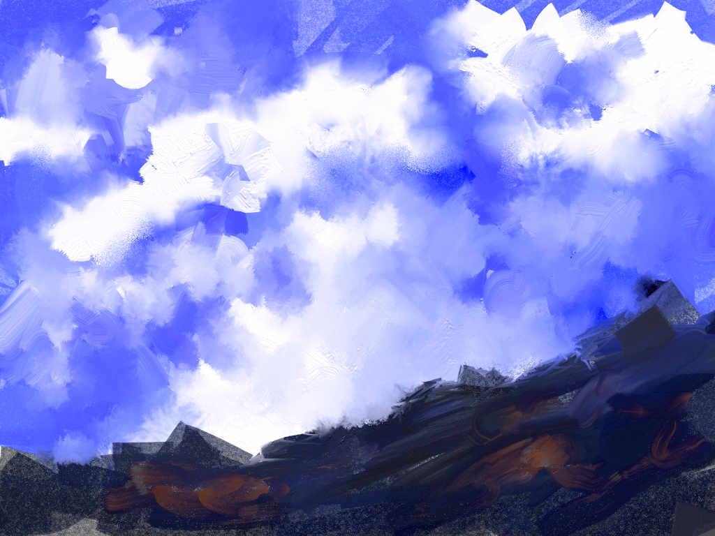
This is a quick painting done using the painting application Procreate, for iPad. I got most of it down but revisited it for some final touches later on. Procreate now supports HD images (better resolution), unfortunately, this was done before that feature was available.

This one was in the Art Rage app.

The Wacom Bamboo Stylus for iPad

Wacom’s much anticipated stylus for the iPad arrived a couple of days ago and I’ve had that time to test it out. I had been waiting for this one for a while, when it finally came available it sold out, leaving me checking the site regularly for a refreshed availability.

I use Wacom products daily. I have two Cintiq’s. I have the older 21 at my office and the newer one at my home office. I have also owned and worn through several of their tablets. That being said, my expectations for an iPad product were quite high.

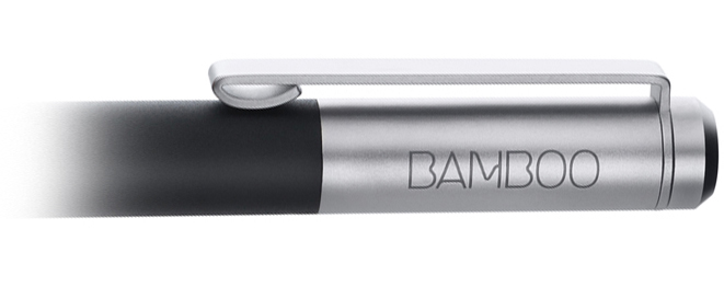
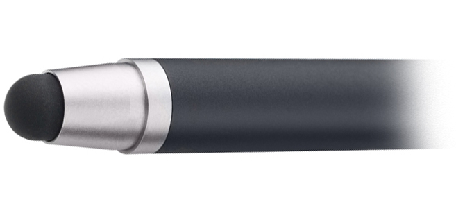
First off, the Wacom Bamboo stylus for iPad and other capacitive screens is a very well made product. It is beautiful to look at and beautiful to hold. It is put together very nicely and and has a clip which you can remove if you prefer- this is a huge plus for me.

It is constructed with aesthetics in mind and is built to last. Mine? Mine should last for ever. Why? Because I don’t plan on using it.

I’ll tell you why.

The tip of a stylus is THE MOST IMPORTANT PART. It’s sort of like a pool cue. It the tip isn’t good, it doesn’t matter much. People always roll their cues on the table, looking for the straightest one- its not a rifle! It’s all in the tip. And, as far as Wacom’s stylus is concerned, we have a beautiful body with a worthless tip. The Bamboo stylus is a BUTTERFACE.

The tip requires too much pressure to use for extended periods of time. It also doesn’t hold it’s shape as well as others do. When using it at any kind of an angle, as humans do, as opposed to vertically, the tip can’t tend to stay lopsided, squished at a slight angle. Other styluses instantly straighten out. The main problem with this is that the metal part closest to the tip tends to start touching the screen.  Not good.

If you are looking for a fine tipped stylus for your iPad or capacitive device, I would recommend the 3M Smart Pen. It’s a better bet.

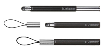
Or, the SGP Kuel. This one has decent craftsmanship but is a little on the thin side. It’s is also close to being too short when not extended.

Back to the Wacom Bamboo Stylus, on the whole, I just cannot recommend this one. It is just not worth the asking price of $30.00. In my opinion, it’s not worth half that.

They will sell fine though. The name Wacom will have them flying out the door for some time to come. I only hope that next time Wacom decides to consult some serious iPad users before releasing a product. I am definitely interested in seeing how they might improve this stylus.


Jim Martin – Concept Artist / 3D Modeler

Allow me to introduce you to my buddy and roommate (cellmate) for the past year over at Dreamworks. Actually, if either of us needs an introduction it would be me- he’s been at this art game for some time. His solid work will undoubtedly speak for that.

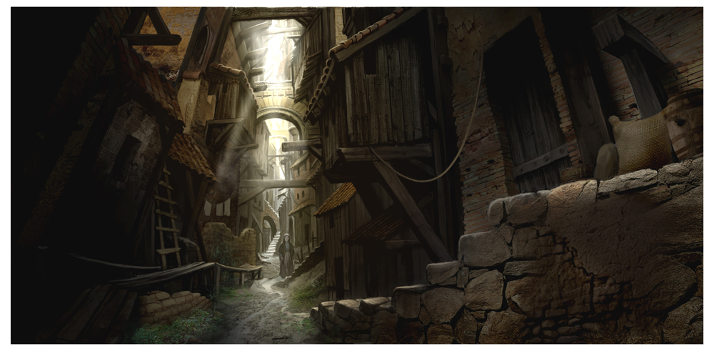
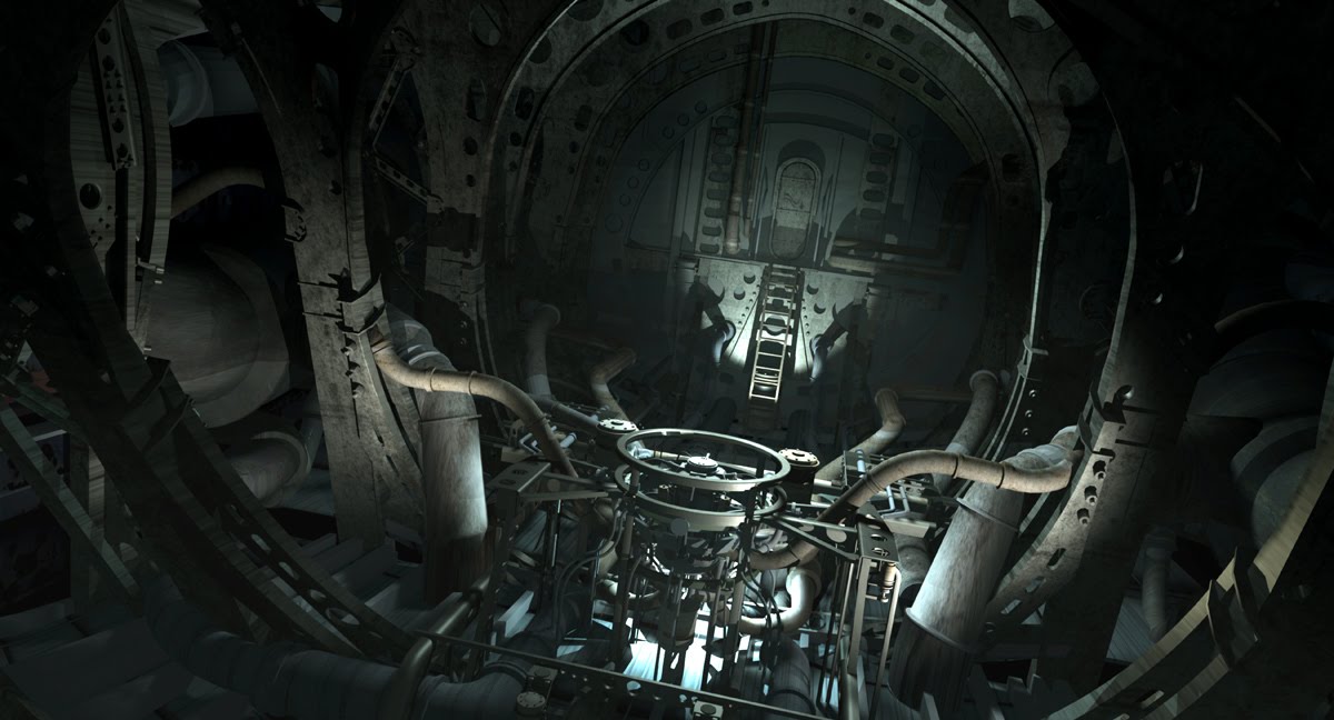
He is a double-threat. A talented 3D modeler, who as far as I’m concerned, and from what I’ve seen, can build a model of just about anything. He can also draw and paint your head off. He has an impressive range, from animation to realistic people, environments- exterior concepts to interiors, oh, and by the way, he thrives on tech.

Checkout his Homepage here:

http://www.jimmartindesign.com/

For more current and up to date work check out his Blog:

http://martinconceptart.blogspot.com/

Jim is a proud family man, a great friend and a wildly talented artist. Not to mention, he is also witty and does some great impersonations. This is just a bonus, but trust me, it really helps getting through the day on the job!