Burn Notice – Season Finale Storyboards

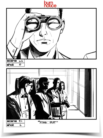
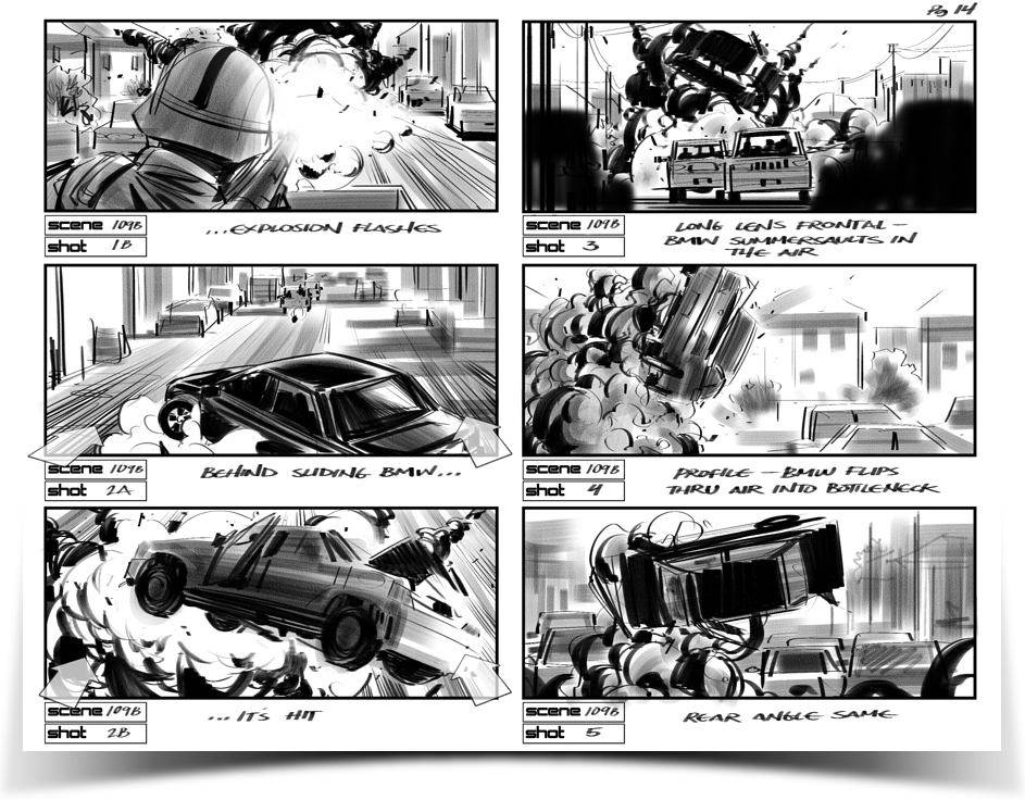
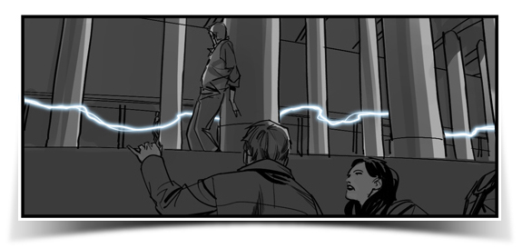
Here are some storyboards I was asked to do for season 5’s finale of Burn Notice. I was on a feature at Dreamworks at the time so I was able to offer a couple hours a night after work as well as weekends.

The workload was ridiculous and these were done directly with no preliminary sketches (clearly).

To see all of the boards click here:

Storyboarding – Traditional vs Digital Media

Storyboards used to be and in many cases still are done using traditional media- paper, pencils, ink pens and markers. These things are easy to carry around and are inexpensive to purchase. They are both basic and fundamental. These basic supplies should be in the kit of any storyboard artist.

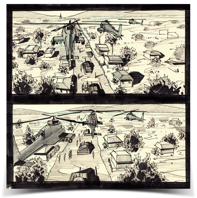
They are essential for situations where an artist is needed in an emergency situation, on location. One example was on a film called Five Days of War, directed my Renny Harlin. I was on location with the crew in a small town called Tsalka, in the Republic of Georgia. There was a huge exodus scene involving hundreds of local extras, thousands of blanks, pyrotechnics, animals, two Georgian attack helicopters and a camera helicopter.  The pilots were Georgian military and didn’t speak English. Renny was running into language barriers and had to be sure the pilot understood how he wanted the scene shot.

I got the call where I was working in a trailer back at base camp. I ran about 4 village blocks, trudging through thick muddy roads to the shooting location and was told what I needed to sketch. I drew up a few shots in a Moleskine notebook which was quickly handed off to Renny. Drawing is a universal language, if you can draw, you can communicate with anyone who can see.  Below are a couple of the on-the-fly boards, done in a matter of minutes for the Georgian helicopter pilot.

[Five Days of War storyboards by Jonathan Gesinski]

For the most part these days, I do work digitally though. There’s no shame to be had in it. Using technology to better your product, provide a better and more useful tool for your client and to work more efficiently is only wise.

Storyboarding or any form of commercial artwork is not fine art. It is impossible to cheat. You do whatever you need to to get your client, be it a director or whomever, something that will help them and ideally make them look as awesome and creative as you can. Using computers to create and manipulate images is an extremely efficient and effective tool. With computers, working digitally, an artist can reuse images already created, easily combine elements into new images, repair and adjust sketches, all in ways not possible when working on actual paper. Again, the aim is to get your client what he needs as fast and accurate as possible. Your job is to convey his idea, to duplicate it so that others can sync up with and work toward making his vision a reality.

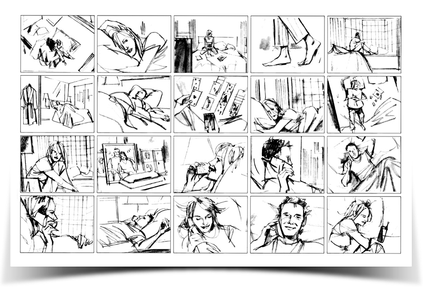
[Five Days of War storyboards by Jonathan Gesinski]

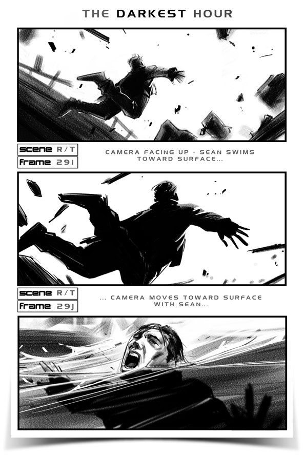
Adobe Photoshop is a great program. I probably don’t even need to mention it. The program I use for all of my commercial, digital artwork is Corel Painter 11. It does have problems, glitches and needs to have plenty of kinks worked out but what makes it worth it is Painter’s brush engine. The brushes in Painter are awesome and often times, work created in Painter can be difficult to tell apart from work created in traditional media. Many clients still don’t like a very “digital” look. This is another situation where Painter comes in handy. You can work digitally and a client who doesn’t like a digital look will be happy with what you turn in.

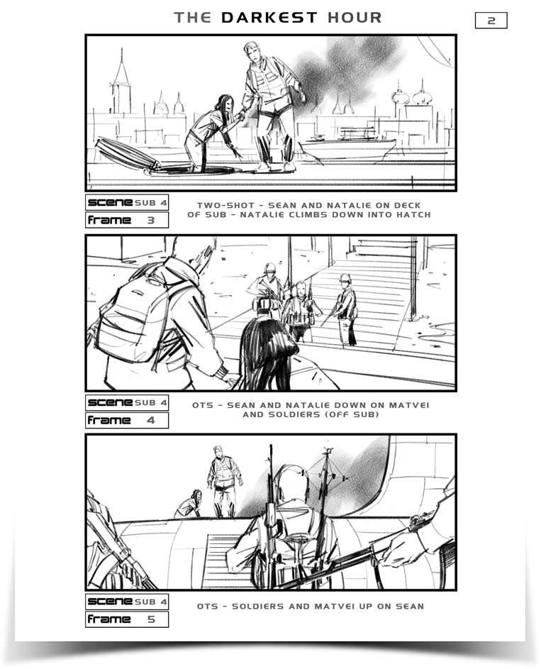
[The Darkest Hour storyboards by Jonathan Gesinski]

Using draw on-screen tablets such as the Wacom Cintiq or tablet computers such as the Axiotron Modbook is also a very natural feeling way to go. Back in the Republic of Georgia, pretty much all of my work was done on a Modbook.

You can see more storyboards and illustration here.

Ideally, being proficient with traditional media is the way to go. Having that tool in your belt, explore going about the same thing using digital tools. See what works best. But ultimately, regardless of how you get there- tell your stories as best you can pull the viewer in and don’t let him go. Draw and draw a lot. Have fun!

Storyboards – The Original and Most Cost-effective Previs

“Previs” is a newer term used in the entertainment industry and is simply a short way of saying “Pre-Visualization”. In an industry which loves its little shortcut names this one is understandable.

Previs is simply a way to visualize how a film could look before spending all the money to make shoot it. Pretty general term, yeah? Nope- not today. These days, previs refers to one type of pre-visualization: 3D animated versions of shots and sequences using, obviously, computer generated 3D models of characters, props and locations, all “shot” with virtual cameras within a computer.

The effect of well done can often look quite amazing, but if the needed amount of work isn’t put in they can easily look rather corny as well. Either way,  it is an excellent way of pre-visualizing a film.

Previs is not easy to do. It requires a lot of time, talented 3D guys and therefor money. Previs teams will often employ storyboard artists to storyboard out the scenes they are going to build in 3D.

I do have a point to make, something I want to point out. Storyboards ARE Previs. If you want to pre visualize a film, the quickest and most cost effective way to do this is not by employing a team of guys with computers, waiting for a month or two for a somewhat crudely animated scene. The most cost effective way to get it done is to hire an artist with a pencil!


[The Darkest Hour storyboards by Jonathan Gesinski]

If you have the time and money, you should consider getting yourself a Previs team to render out your most important and hard to describe scenes and shots to get difficult shots figured out before getting out the fancy cameras, dressing your expensive sets and making up your talent. If you want a crisp, clear, relatively cheap and quick visual version of your film or key scenes- storyboard it!


[Five Days of War storyboards by Jonathan Gesinski]

To see some of our storyboards click here.

What Are Storyboards?

What are Storyboards?

Originally used primarily in animation, the storyboard used to be called a story sketch. The first storyboard artists were called story sketch artists. The name story sketch artist should tell you all you need to know about what they did. They sketched out stories or told stories using sketches. The word “board” came about because these small, sequential sketches created by these story telling artists were often mounted on a large board or sometimes a wall so that they could be viewed in order and could do their job collectively in telling a story. These “story boards” were viewed by others involved in the overall task of creating the final product, be it an animated or live action film. They helped the entire crew get in sync with one another and work together toward that final vision.


[Storyboards by Shari Wickstrom]

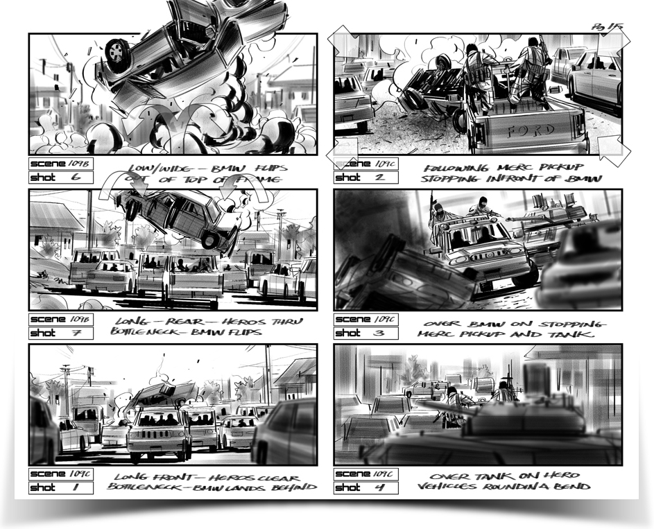
Imagine you were preparing to film your own movie and were working with many different talented and creative people to make it all happen. You have a lot of money invested and need to get it right. You have an action scene to film which involves a “red sports car”. Everyone in your crew who reads that in the script are going to imagine something different, even though they will all imagine what would be correctly described as a red sports car. Some will see Mustangs, others Ferraris. The car is described as “flipping violently” as its final, dramatic scene comes to a crashing end. Some guys will imagine it tumbling end over end, others will picture it rolling over its sides. Some might even see it hurling through the air like a frisbee. And, per the script- none of them are wrong!

This is where the Director of the film comes in. Primarily, his job is to be the the guy with the most ideal envisioning of the story. It’s his (or hers) imagined version of the story which is going to be translated to film. How does he insure that the rest of his crew works toward his vision? Do the producers just gamble on the idea that his verbal explanation will be enough? He does use good hand gestures when he talks… no. Imagine the stunt with the red sports car. The stunt coordinator goes ahead and rigs the car for the flipping shot and while it is technically still right, it’s not at all what the director envisioned- so, basically it’s wrong. Do you just settle for such mistakes when Hollywood money is at stake? Just bring out another Ferrari and load a new roll of film? Re-rig everything and burn another tens of thousands of dollars? Or, do you come up with a more simple and far more cost effective solution- storyboard out the scene long before you shoot.

[Twelve Rounds storyboards by Jonathan Gesinski]

Directors use storyboards regularly these days, not just in animation, but for live action film, television, music videos and television advertising. Storyboards aren’t just used for production purposes as described above, they are also used as a relatively inexpensive means of showing a client, say someone with a product they want you to shoot a commercial for, what the final commercial will look like. When dealing with the amounts of money it costs to make these things, when writing checks with such big numbers, it’s good to have a clear idea of what you’re getting. As a film maker, you’re dealing with a visual media- simply telling your client what you’re planning to do isn’t going to be enough. If you want to sell him, you have to show him.


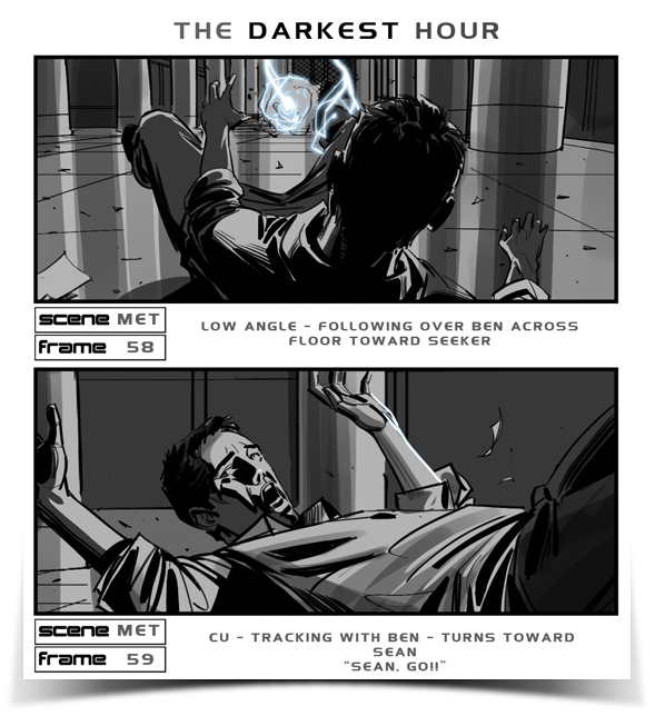
[The Darkest Hour storyboards by Jonathan Gesinski]

Storyboards are usually drawn by talented artists. Some people try to cut corners and save even more money by using snapshots but these tend to look amateur and can limit  what you can show. You’re locked into what you can photograph and don’t have the flexibility that and artist with a pencil will provide.

While storyboards are a form of illustration, they don’t always need to look beautiful. An illustrator working on a single illustration needs that one piece to hold its own and blow some minds. In storyboarding it’s a little different. Each image itself is less meaningful and ideally isn’t meant to stand on it’s own. Collectively, a well thought out sequence of images, viewed together in correct order which tell a story- this grouping of smaller works is the storyboard artist’s illustration.

[Storyboards by Shari Wickstrom]

Each small illustration or “panel” (more of an older animation term) or “frame” (more modern term used in film) is like a brick. On its own it isn’t so fantastic, just a brick. Grouped together with care and creativity and you end up with a cathedral or a Great Wall of China.

[The Darkest Hour storyboards by Jonathan Gesinski]

A well thought out sequence is more important than each frame being drawn incredibly beautifully. Often times the client will just need a raw, basic and rather crude layout of a sequence sketched up. Everyone knows at this point that the red car is going to be a Ferrari so in your super sketchy storyboard frames it just might just need to be clear that it’s a car, period.

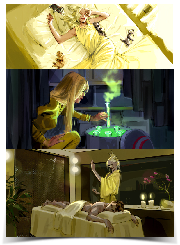
Other times though, it may be very important to have that car look amazing. Maybe the boards are intended to dazzle the investors, romance the studio heads and help produce more excitement and therefor money for the budget. This can be the case. The ideal storyboard is one which tells a story clearly and which also conveys a sense of the aesthetic which the final, filmed product intends to have.

[Storyboards by Shari Wickstrom]

The storyboard is often the first visualization of a finished film or video. It can be described as being similar to a comic book or comic strip but unlike those, it is not the end product but rather, it is an envisioning of the final product- a roadmap to it.

Doodles co is a very small and tight group of storyboard artists and illustrators who work out of the Los Angeles area but whom also tend to travel for work. We have been working in the film and advertising industries for many years. You can view our résumés and samples of our storyboard and illustration work here.


iPad Sketches

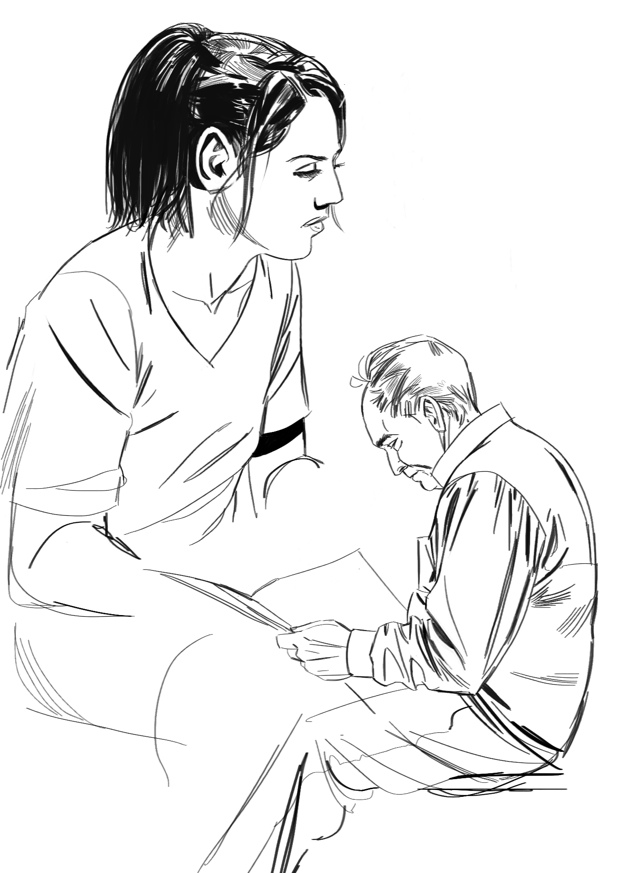
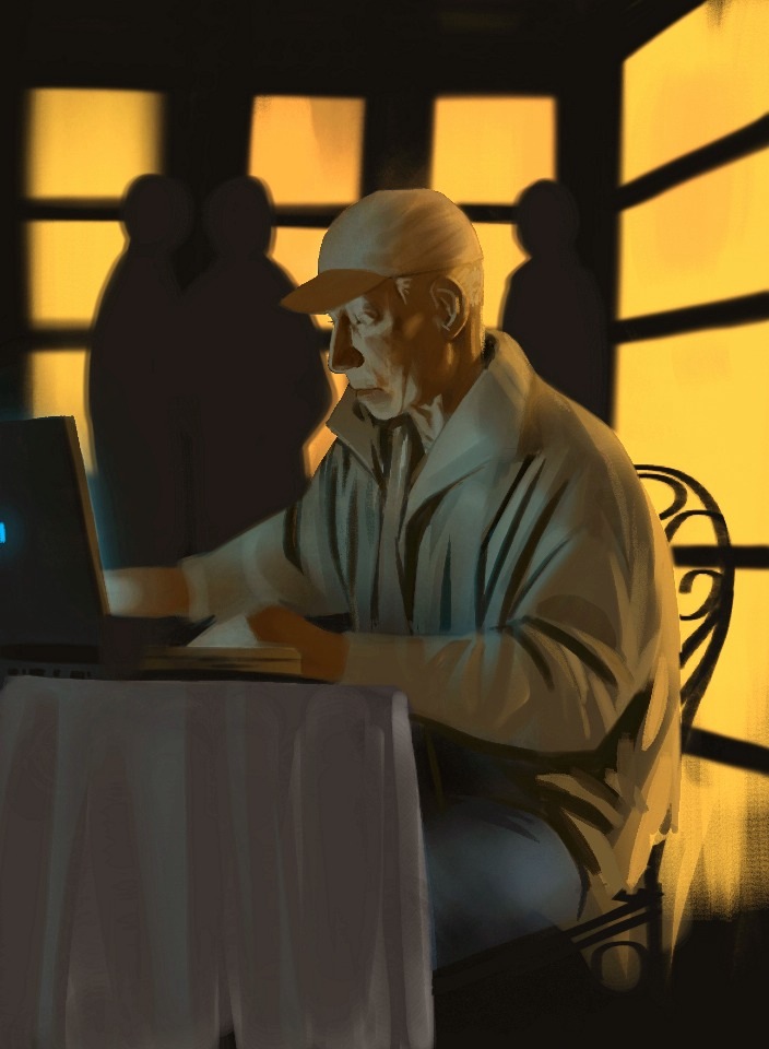
These sketches were done at a local coffee shop. Just folks hanging around. Done using the Procreate app for iPad.

20111013-012719.jpg

For Sisu

This is a quicker painting done on the iPad using Procreate. I cropped it and brightened it a little in Photoshop.

I did this painting for my dog Sisu. He passed away a year ago. On the anniversary of the last day I had with him, I stopped at Griffith Park on my way home from work and started painting while there was a little light left in the sky. I got a rough block in done and finished it working from a photo I snapped before hiking back down. He used to come up there with me all the time. Sometimes he’d wait for me while I did little plein air sketches. He was easily one of the best friends I’ve ever had. I miss him dearly and hope he’s doing well wherever he is.

The iPad Stylus We’ve Been Dreaming of? The Zeppelin Stylus!

There are many different styluses out there, many of which are pretty good. The quality and function seem to be getting better and better. The Jot stylus seems to have raised the bar when it comes to precision and responsiveness but can it be raised even more?

http://www.youtube.com/watch?v=l-vOafGpML4&feature=youtu.be

Let me introduce you to the Zeppelin Stylus. This one is currently just a dream, a dream stylus being dreamed of by many artists and note takers who are hungry for a pen input device which would let them use their iPad the way we’ve all been imagining, hoping… dreaming. The Zeppelin is a Kickstarter project, just like the Jot, which is now a very successful and workable stylus for touch screen devices. The Jot does have its problems though and there is definitely room for improvement. The Zeppelin really does appear to have a very solid design.

There is a week left for the Zeppelin to meet its funding goals. This dream stylus needs backers to become a reality… otherwise it remains a dream.

Head over to the Zeppelin’s Kickstarter page and check it out. If you like what you see and want to be a part of something cool and very potentially rewarding join me and become a backer!


iPad sketches

This is a quick painting done using the painting application Procreate, for iPad. I got most of it down but revisited it for some final touches later on. Procreate now supports HD images (better resolution), unfortunately, this was done before that feature was available.

This one was in the Art Rage app.

Adonit Jot Turns iPad into Mobile Cintiq

The Jot from Adonit is a great stylus. Fresh out of the gate Adonit are still making good with their Kickstarter backer’s orders before attending to normal buyers.

I’ve heard a couple skeptical opinions on the clear disc and agree that at first it is a little odd. When you think of a pen, you think of a point or something as close to that as possible. This design is far from it- or is it?

As a working, professional (whatever that really means) storyboard and concept artist, the thing I’m looking for, ideally, is a mobile Cintiq. I want to know that I can work at the airport, on a set, in a tree, on a train, in my bed, on the pot… With a Cintiq from Wacom you can do some pretty amazing work but you can’t just pick it up and take it with you.

Until now, I’ve been using various, normal stubby, rubber-tipped capacitive styluses with my iPad. Honestly, I haven’t been drawing or painting on it much at all in that I’ve been working so much but when I have, it’s really been sort of a faking my way with it. It’s not to easy or fun to do any kind of precision work with what boils down to a dull crayon.

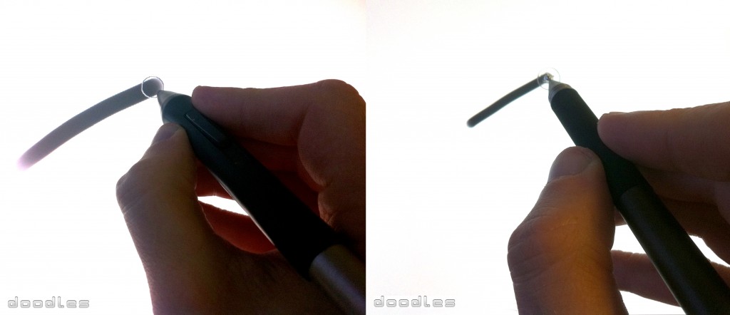
Enter the Adonit Jot stylus. Now, let me show you two photographs. I took these at work while on my lunch break.

On the left is a Wacom pen on a Cintiq. On the right is the Adonit Jot on the iPad. If you think about the Jot as not having a disc as a tip but rather a small, metal tip- then the disc just becomes the brush cursor. It’s a fine tip stylus with a brush cursor built around the tip.

Read the full review of the Adonit Jot.

Adonit Jot Stylus for iPad – Review

With regards to styluses for the iPad and capacitive screens in general- the bar has been raised.

The Jot Stylus by Adonit was not only a successful Kickstarter project, it was a majorly successful one pulling in droves of excited would be customers, I was among those droves.

The stylus looks very similar to diagrams submitted by her majesty Apple herself.
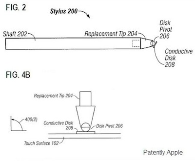
These guys at Adonit, really took the time to do it right. The stylus works very well and makes sketching, painting and writing on the iPad very easy and brings a more effortless and natural feel.

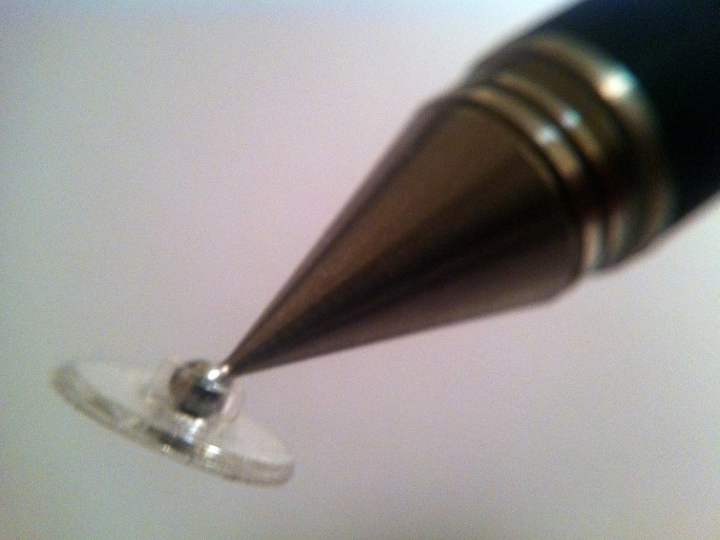
The tip is not your normal rubber or foam, instead it employs a clear plastic disk which pivots on a small metal ball which is the actual tip of the pen.
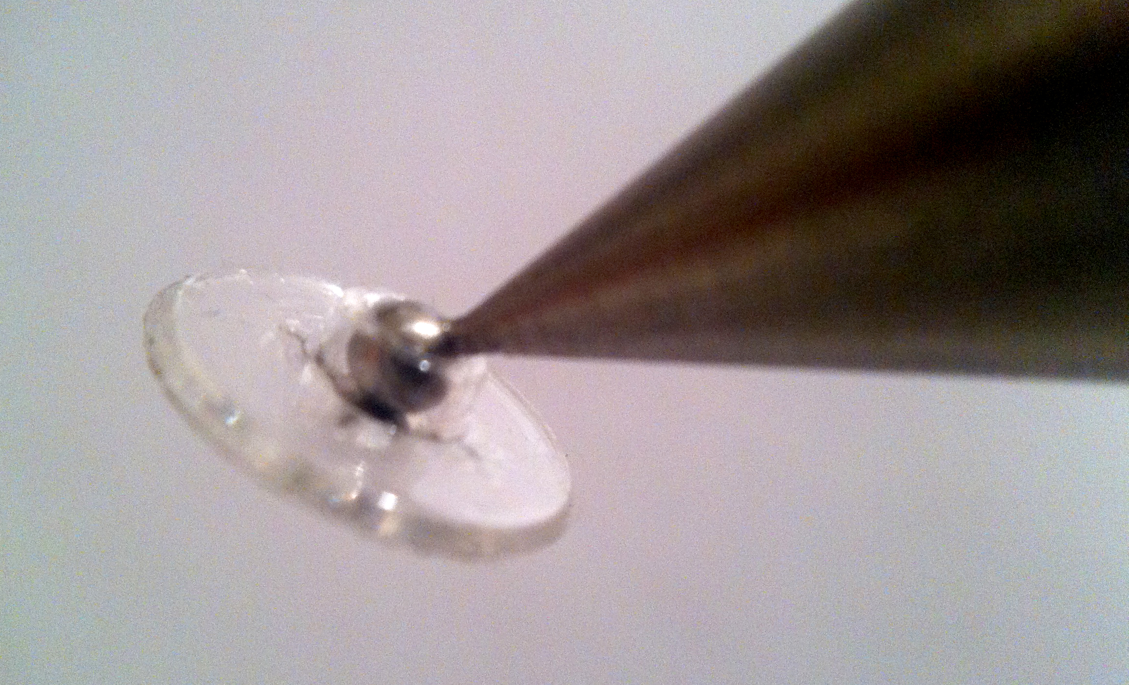
The sensitivity is fantastic and the small, clear disk seems to vanish while you’re using it. Provided that the app’s input point doesn’t have an offset, the lines you create seem to come right from the point of the stylus.

There are other stylus which work well- the best of them is the 3M Smart Pen. It’s tip is extremely sensitive and I highly recommend it for effortless iDoodling, but when it comes to fine line work, accurate detail, nothing on the market can compete with the Jot. Illustration, concept art and storyboards are now actually possible to do on a mobile platform such as the iPad using a precision stylus such as the Jot and a terrific digital art application such as Procreate from Savage Interactive.

The Jot brings a true Wacom Cintiq feel to the iPad. You can see where you’re marking and can draw without those creativity hindering little blind spots.

The Jot is very well made, this is no cheaply thrown together product. The body is made from aluminum and steel. Available in two models- the standard Jot and the Jot Pro.
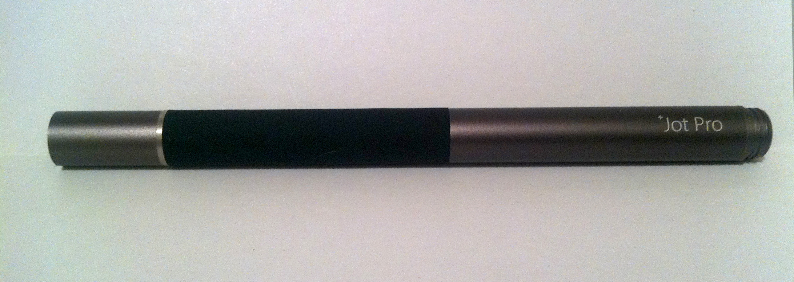
The Pro model has a rubber grip and is available in a dark gunmetal gray, a sliver color and a blue. It also has magnetic innards which allow you to attach your stylus to your iPad 2, or your fridge. I wouldn’t recommend trusting the magnetic hold to your iPad too far though, it’s good but not great.

The basic model is currently only available in three bright, colorful colors- green, red and a purplish blue. I’m not crazy about the rubber grip though most people will probably love it. I’m also not a fan at all of the three colors that the basic Jot comes in. I’m currently nudging them to make standard Jots in silver and black. We’ll see.

All models of the Jot will perform equally well. The only difference is the magnetics, the rubber grip and the color options. They all come with a screw on cap to protect the disk tip. Once removed, the cap can be screwed onto the back of the stylus- extending the length of the stylus to an even more comfortable size.

The basic model will cost you $20.00 while the Pro model comes in ten dollars more at $30.00. Both models are under priced and well worth the money. If you want a seriously serious stylus, with quality design, construction and performance- seriously consider looking at getting yourself a Jot.

The Adonit Jot can be purchased from their website:

http://adonit.net

If you’ve used the Jot let us know what you think of it. If you haven’t used one and have any questions- just ask because we have.


Disk Problems Update:

The Jot has proven to have a very nice and responsive tip when it is new but after just a couple of weeks of use it can start to feel jiggly, loose and less responsive.

Here is a very quick, cheap and effective fix to a Jot Stylus tip which has become limp feeling and which has lost its responsiveness:


1. Simply disconnect the disc from the ball point.

2. Take a 3″ x 3″ piece of aluminum foil and consecutively fold it 3 times to create 8 stacked layers. (You may want to try fewer layers, depending)

3. Place the folded foil on top of the disc hub that the ball point belongs in.

4. Place (do not snap in yet) the ball point gently on top of the foil directly above the hub opening which will gently conform the foil into a bowl shape in the hub (do not break yet).

5. One the foil is gently conformed in place of the hub opening, increase the pressure of the ball point until it snaps in the hub. (Do this with the disc placed flush on a hard, flat surface so that the clean flatness of the disc is not dented by the stylus tip popping back into the disc.) The desired aluminum bowl in the hub will detach from the rest of the surrounding foil and just simply tear off the remains around the hub. Your stylus will become drastically more sensitive as there is now much more conductive surface area between the disc and the ball point.

Note you will not physically see any difference in your stylus but will notice the disc movement will feel snug as the disc is no longer loosely attached to the ball point. I find this more than tolerable and actually prefer the sturdy feel of quality while maintaining complete 45 degrees of movement. Even with my screen protecter, I can barely hover over the screen and the stylus will register…amazing improvement! I have fallen in live with my stylus all over again.
Source:

http://support.adonit.net/entries/20701496-disk-not-sensitive-enough-easy-solution

We at doodles co have used this tip and it is perfect. Not only will it re-up the performance of your Jot, it can make it better than new- in our humble opinion.